..最近这段时间在着手做一个开源项目..使用新鲜的Kotlin以及Google最经典的MaterialDesign..由于刚开始使用自然会碰到很多坑..上面是我的项目Logo🤣
本篇文章重点讲解最经典的MaterialDesign中的抽屉式布局 Navigation Drawer虽然AndroidStudio已经集成了Sample但跟手复现一遍还是很受益的。

在2015年I/O大会上..Google发布了NavigationView,与之前的官方文档相比,本文档更容易创建完整的抽屉式布局
随着Android 5.0 Lollipop的发布,新的材料设计风格的抽屉横跨屏幕的整个高度,并显示在ActionBar半透明的上方并重叠StatusBar
Like this:

Usage

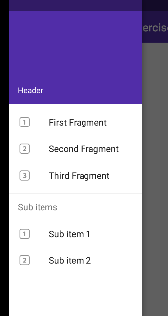
本指南将介绍如何建立一个基于MaterialDesign的可以切换不同Fragment到内容区域的抽屉式导航。In this way,you can define multiple fragments, and then define the list of options which will display in the drawers items list. Each item when clicked will switch the relevant fragment into the activity’s container view.

Setup

Make sure to setup the Google Design Support Library before using Google’s new NavigationView,announced as part of the Android M release. The NavigationView should be backwards compatible with all versions down to Android 2.1.

Make sure you have this Gradle dependency added to your app/build.gradle file:

1
2
3
dependencies {
implementation 'com.android.support:design:27.1.1'
}

Setup Drawer Resources

Create a menu/drawer_view.xml file:

1
2
3
4
5
6
7
8
9
10
11
12
13
14
15
16
17
<menu xmlns:android="http://schemas.android.com/apk/res/android">
<group android:checkableBehavior="single">
<item
android:id="@+id/nav_first_fragment"
android:icon="@drawable/ic_one"
android:title="First" />
<item
android:id="@+id/nav_second_fragment"
android:icon="@drawable/ic_two"
android:title="Second" />
<item
android:id="@+id/nav_third_fragment"
android:icon="@drawable/ic_three"
android:title="Third" />
</group>
</menu>

Note that you can set one of these elements to be default selected by using android:checked="true" .

You can also create subheaders too and group elements together:

1
2
3
4
5
6
7
8
9
10
11
12
<item android:title="Sub items">
<menu>
<group android:checkableBehavior="single">
<item
android:icon="@drawable/ic_dashboard"
android:title="Sub item 1" />
<item
android:icon="@drawable/ic_forum"
android:title="Sub item 2" />
</group>
</menu>
</item>

Define Fragments

接下来,你需要来定义你的Fragments,这些Fragments将会显示在你的Activity中。
These can be any support fragments you define within your application. Make sure that all the fragments extend from android.support.v4.app.Fragment.

Setup Toolbar

In order to slide our navigation drawer over the ActionBar, we need to use the new Toolbar widget as defined in the AppCompat v21 library.The Toolbar can be embedded into your view hierarchy which makes sure that the drawer slides over the ActionBar.

Create a new layout file res/layout/toolbar.xml with the following code:

1
2
3
4
5
6
7
8
9
10
11
<android.support.v7.widget.Toolbar
xmlns:android="http://schemas.android.com/apk/res/android"
xmlns:app="http://schemas.android.com/apk/res-auto"
android:id="@+id/toolbar"
android:layout_height="wrap_content"
android:layout_width="match_parent"
android:fitsSystemWindows="true"
android:minHeight="?attr/actionBarSize"
app:theme="@style/ThemeOverlay.AppCompat.Dark.ActionBar"
android:background="?attr/colorPrimaryDark">
</android.support.v7.widget.Toolbar>

Note that when the android:fitsSystemWindows attribute is set to true for a view, the view would be laid out as if the StatusBar and the ActionBar were present i.e. the UI on top gets padding enough to not be obscured by the navigation bar. Without this attribute, there is not enough padding factored into consideration for the ToolBar:

We want our main content view to have the navigation bar and hence android:fitsSystemWindows is set to true for the Toolbar.

To use the Toolbar as an ActionBar, you need to disable the default ActionBar. This can be done by setting the app theme in styles.xml file.

1
2
3
4
5
6
7
8
<resources>
<!-- Base application theme. -->
<style name="AppTheme" parent="Theme.AppCompat.Light.NoActionBar">
<item name="colorPrimary">#673AB7</item>
<item name="colorPrimaryDark">#512DA8</item>
<item name="colorAccent">#FF4081</item>
</style>
</resources>

Also note that normally you should decide on your color scheme by going to Material Palette and choosing a primary and dark primary color. For this example, we will pick purple-based colors as shown in the screenshot.

Note: If you forget to disable the ActionBar in styles.xml, you are likely to see a java.lang.IllegalStateException with an error message that reads This Activity already has an action bar supplied by the window decor. Do not request Window.FEATURE_ACTION_BAR and set windowActionBar to false in your theme to use a Toolbar instead.If you see this message, you need to make sure to follow the previous steps.

Setup Drawer in Activity

Next, let’s setup a basic navigation drawer based on the following layout file which has the entire drawer setup in res/layout/activity_main.xml. Note that the Toolbar is added as the first child of the main content view by adding the include tag. Note: if you are using a CoordinatorLayout, it must not lie outside of the DrawerLayout. See https://stackoverflow.com/questions/32523188/coordinatorlayout-appbarlayout-navigationdrawer

1
2
3
4
5
6
7
8
9
10
11
12
13
14
15
16
17
18
19
20
21
22
23
24
25
26
27
28
29
30
31
32
33
34
35
36
37
38
<!-- This DrawerLayout has two children at the root -->
<android.support.v4.widget.DrawerLayout
xmlns:android="http://schemas.android.com/apk/res/android"
xmlns:app="http://schemas.android.com/apk/res-auto"
android:id="@+id/drawer_layout"
android:layout_width="match_parent"
android:layout_height="match_parent">
<!-- This LinearLayout represents the contents of the screen -->
<LinearLayout
android:layout_width="match_parent"
android:layout_height="match_parent"
android:orientation="vertical">
<!-- The ActionBar displayed at the top -->
<include
layout="@layout/toolbar"
android:layout_width="match_parent"
android:layout_height="wrap_content" />
<!-- The main content view where fragments are loaded -->
<FrameLayout
android:id="@+id/flContent"
app:layout_behavior="@string/appbar_scrolling_view_behavior"
android:layout_width="match_parent"
android:layout_height="match_parent" />
</LinearLayout>
<!-- The navigation drawer that comes from the left -->
<!-- Note that `android:layout_gravity` needs to be set to 'start' -->
<android.support.design.widget.NavigationView
android:id="@+id/nvView"
android:layout_width="wrap_content"
android:layout_height="match_parent"
android:layout_gravity="start"
android:background="@android:color/white"
app:menu="@menu/drawer_view" />
</android.support.v4.widget.DrawerLayout>

Now, let’s setup the drawer in our activity. We can also setup the menu icon too.

1
2
3
4
5
6
7
8
9
10
11
12
13
14
15
16
17
18
19
20
21
22
23
24
25
26
27
28
29
30
31
32
33
34
35
36
37
38
39
public class MainActivity extends AppCompatActivity {
private DrawerLayout mDrawer;
private Toolbar toolbar;
private NavigationView nvDrawer;
// Make sure to be using android.support.v7.app.ActionBarDrawerToggle version.
// The android.support.v4.app.ActionBarDrawerToggle has been deprecated.
private ActionBarDrawerToggle drawerToggle;
@Override
protected void onCreate(Bundle savedInstanceState) {
super.onCreate(savedInstanceState);
setContentView(R.layout.activity_main);
// Set a Toolbar to replace the ActionBar.
toolbar = (Toolbar) findViewById(R.id.toolbar);
setSupportActionBar(toolbar);
// Find our drawer view
mDrawer = (DrawerLayout) findViewById(R.id.drawer_layout);
}
@Override
public boolean onOptionsItemSelected(MenuItem item) {
// The action bar home/up action should open or close the drawer.
switch (item.getItemId()) {
case android.R.id.home:
mDrawer.openDrawer(GravityCompat.START);
return true;
}
return super.onOptionsItemSelected(item);
}
}

Setup a handler to respond to click events on the navigation elements and swap out the fragment. This can be put into the activity directly:

1
2
3
4
5
6
7
8
9
10
11
12
13
14
15
16
17
18
19
20
21
22
23
24
25
26
27
28
29
30
31
32
33
34
35
36
37
38
39
40
41
42
43
44
45
46
47
48
49
50
51
52
53
54
55
56
57
58
59
60
61
62
63
64
65
66
67
68
69
70
71
public class MainActivity extends AppCompatActivity {
// ...
@Override
protected void onCreate(Bundle savedInstanceState) {
// ...From section above...
// Find our drawer view
nvDrawer = (NavigationView) findViewById(R.id.nvView);
// Setup drawer view
setupDrawerContent(nvDrawer);
}
private void setupDrawerContent(NavigationView navigationView) {
navigationView.setNavigationItemSelectedListener(
new NavigationView.OnNavigationItemSelectedListener() {
@Override
public boolean onNavigationItemSelected(MenuItem menuItem) {
selectDrawerItem(menuItem);
return true;
}
});
}
public void selectDrawerItem(MenuItem menuItem) {
// Create a new fragment and specify the fragment to show based on nav item clicked
Fragment fragment = null;
Class fragmentClass;
switch(menuItem.getItemId()) {
case R.id.nav_first_fragment:
fragmentClass = FirstFragment.class;
break;
case R.id.nav_second_fragment:
fragmentClass = SecondFragment.class;
break;
case R.id.nav_third_fragment:
fragmentClass = ThirdFragment.class;
break;
default:
fragmentClass = FirstFragment.class;
}
try {
fragment = (Fragment) fragmentClass.newInstance();
} catch (Exception e) {
e.printStackTrace();
}
// Insert the fragment by replacing any existing fragment
FragmentManager fragmentManager = getSupportFragmentManager();
fragmentManager.beginTransaction().replace(R.id.flContent, fragment).commit();
// Highlight the selected item has been done by NavigationView
menuItem.setChecked(true);
// Set action bar title
setTitle(menuItem.getTitle());
// Close the navigation drawer
mDrawer.closeDrawers();
}
// ...
}

Add Navigation Header

The NavigationView also accepts a custom attribute that can reference a layout that provides a header of our layout. For instance, you can create a layout/nav_header.xml similar to the following:

1
2
3
4
5
6
7
8
9
10
11
12
13
14
15
16
17
<LinearLayout xmlns:android="http://schemas.android.com/apk/res/android"
android:layout_width="match_parent"
android:layout_height="192dp"
android:background="?attr/colorPrimaryDark"
android:padding="16dp"
android:theme="@style/ThemeOverlay.AppCompat.Dark"
android:orientation="vertical"
android:gravity="bottom">
<TextView
android:layout_width="match_parent"
android:layout_height="wrap_content"
android:text="Header"
android:textColor="@android:color/white"
android:textAppearance="@style/TextAppearance.AppCompat.Body1"/>
</LinearLayout>

You would then reference this in the layout res/layout/activity_main.xml in the NavigationView with the app:headerLayout custom attribute:

1
2
3
4
5
6
7
8
<!-- res/layout/activity_main.xml -->
<!-- The navigation drawer -->
<android.support.design.widget.NavigationView
...
app:headerLayout="@layout/nav_header">
</android.support.design.widget.NavigationView>

This app:headerLayout inflates the specified layout into the header automatically. This can alternatively be done at runtime with:

1
2
3
4
5
6
7
8
9
// Lookup navigation view
NavigationView navigationView = (NavigationView) findViewById(R.id.nav_draw);
// Inflate the header view at runtime
View headerLayout = navigationView.inflateHeaderView(R.layout.nav_header);
// We can now look up items within the header if needed
ImageView ivHeaderPhoto = headerLayout.findViewById(R.id.imageView);

Getting references to the header

Note: Version 23.1.0 of the design support library switches NavigationView to using a RecyclerView and causes NPE (null exceptions) on header lookups unless the header is added at runtime. If you need to get a reference to the header, you need to use the new getHeaderView()method introduced in the latest v23.1.1 update:

1
2
3
4
5
6
7
// There is usually only 1 header view.
// Multiple header views can technically be added at runtime.
// We can use navigationView.getHeaderCount() to determine the total number.
View headerLayout = navigationView.getHeaderView(0);

动画汉堡图标

为了让汉堡包图标动画显示抽屉正在打开和关闭,我们需要使用ActionBarDrawerToggle类。

在你的res/values/strings.xml添加如下内容:

1
2
3
4
5
<?xml version="1.0" encoding="utf-8"?>
<resources>
<string name="drawer_open">Open navigation drawer</string>
<string name="drawer_close">Close navigation drawer</string>
</resources>

我们需要将DrawerLayout和工具栏结合在一起:

1
2
3
4
5
6
7
8
9
10
11
12
13
14
15
16
17
18
19
20
21
22
23
protected void onCreate(Bundle savedInstanceState) {
// Set a Toolbar to replace the ActionBar.
toolbar = (Toolbar) findViewById(R.id.toolbar);
setSupportActionBar(toolbar);
// Find our drawer view
mDrawer = (DrawerLayout) findViewById(R.id.drawer_layout);
drawerToggle = setupDrawerToggle();
// Tie DrawerLayout events to the ActionBarToggle
mDrawer.addDrawerListener(drawerToggle);
}
private ActionBarDrawerToggle setupDrawerToggle() {
// NOTE: Make sure you pass in a valid toolbar reference. ActionBarDrawToggle() does not require it
// and will not render the hamburger icon without it.
return new ActionBarDrawerToggle(this, mDrawer, toolbar, R.string.drawer_open, R.string.drawer_close);
}

接下来,我们需要确保在恢复屏幕或配置发生变化(即屏幕旋转)时同步状态:

1
2
3
4
5
6
7
8
9
10
11
12
13
14
15
16
17
18
19
20
21
22
23
// `onPostCreate` called when activity start-up is complete after `onStart()`
// NOTE 1: Make sure to override the method with only a single `Bundle` argument
// Note 2: Make sure you implement the correct `onPostCreate(Bundle savedInstanceState)` method.
// There are 2 signatures and only `onPostCreate(Bundle state)` shows the hamburger icon.
@Override
protected void onPostCreate(Bundle savedInstanceState) {
super.onPostCreate(savedInstanceState);
// Sync the toggle state after onRestoreInstanceState has occurred.
drawerToggle.syncState();
}
@Override
public void onConfigurationChanged(Configuration newConfig) {
super.onConfigurationChanged(newConfig);
// Pass any configuration change to the drawer toggles
drawerToggle.onConfigurationChanged(newConfig);
}

我们还需要更改onOptionsItemSelected()方法并允许ActionBarToggle处理事件。

1
2
3
4
5
6
7
@Override
public boolean onOptionsItemSelected(MenuItem item) {
if (drawerToggle.onOptionsItemSelected(item)) {
return true;
}
return super.onOptionsItemSelected(item);
}

ActionBarToggle将执行与先前完成的功能相同的功能,但会添加更多检查,并允许鼠标​​单击图标以打开和关闭抽屉。有关更多上下文,请参阅源代码

有一点需要注意的是,ActionBarDrawerToggle会为您呈现汉堡图标的自定义DrawerArrowDrawable

另外,请确保使用的android.support.v7.app.ActionBarDrawerToggle版本。在android.support.v4.app.ActionBarDrawerToggle已被弃用。

使状态栏半透明

要使状态栏变成半透明状态并让我们的抽屉滑过它,我们需要将其设置android:windowTranslucentStatus为true。由于此样式不适用于之前的Kitkat设备,因此我们将为res/values-v19/styles.xmlAPI版本19及之后的版本添加 文件。 注意:如果res/values/styles.xml直接用此android:windowTranslucentStatus行修改,则可能需要构建仅适用于19或更高版本的SDK,这显然会限制您支持许多较旧的设备。

res/values-v19/styles.xml我们可以添加以下内容:

1
2
3
4
5
6
7
<resources>
<!-- Base application theme. -->
<style name="AppTheme" parent="Theme.AppCompat.Light.NoActionBar">
<!-- Customize your theme here. -->
<item name="android:windowTranslucentStatus">true</item>
</style>
</resources>

现在,如果你运行你的应用程序,你应该看到导航抽屉,并能够在你的片段之间进行选择。

将自定义视图添加到导航抽屉

对设计支持库23.1.0所做的一项改进是增加了对导航抽屉项目的自定义视图的支持。例如,我们可以为其中一行创建自定义开关,如Google Play电影的导航抽屉:

该方法与将ActionView项目添加到ActionBar相同。我们只需要定义一个单独的布局,如下面的代码片段。我们将调用这个文件action_view_switch.xml

1
2
3
4
5
6
7
8
9
10
<?xml version="1.0" encoding="utf-8"?>
<LinearLayout xmlns:android="http://schemas.android.com/apk/res/android"
android:orientation="horizontal" android:layout_width="match_parent"
android:layout_height="match_parent">
<android.support.v7.widget.SwitchCompat
android:layout_width="fill_parent"
android:layout_height="match_parent"
android:text="Switch"/>
</LinearLayout>

然后,我们使用该app:actionLayout属性引用此布局。标题必须提供,但也可以设置为空白:

1
2
3
4
5
<menu xmlns:app="http://schemas.android.com/apk/res-auto" xmlns:android="http://schemas.android.com/apk/res/android">
<item android:id="@+id/nav_switch"
app:actionLayout="@layout/action_view_switch"
android:title="Downloaded only" />
</menu>

只要您的活动将实施该方法,您就可以直接使用XML附加事件。要通过Java以编程方式将事件处理添加到切换开关,您需要先获取菜单实例并访问相应的ActionView:

1
2
3
4
5
6
7
8
9
Menu menu = navigationView.getMenu();
MenuItem menuItem = menu.findItem(R.id.nav_switch);
View actionView = MenuItemCompat.getActionView(menuItem);
actionView.setOnClickListener(new View.OnClickListener() {
@Override
public void onClick(View v) {
}
});

自定义小部件的使用app:actionViewClass也可以用于菜单项目。有关Action Views的更多详细信息,请参阅将SearchView添加到ActionBar指南。

持久导航抽屉

在某些情况下,特别是在平板电脑上,导航抽屉应该是充当侧栏的活动的永久固定装置(Like my Blog Design):

要达到此效果,请查看以下描述一种方法的链接:

第三方库也可能使这更容易实现。

第三方库

有一些第三方库仍然可以作为DrawerLayout直接使用自动提供某些材料设计元素的替代方案:

通常这些都是不必要的,但请检查它们以查看它们提供的功能。

限制

设计支持库的当前版本的确有其局限性。主要问题在于突出显示导航菜单中的当前项目的系统。NavigationView的itemBackground属性不能正确处理项目的选中状态:不管怎样,所有项目都突出显示或者没有任何项目。这使得这个属性基本上不适用于大多数应用程序。

Fragment的替代品

虽然许多导航抽屉示例显示了如何将Fragment用于导航抽屉,但如果您希望将抽屉用作当前显示的活动的叠加层,也可以使用RelativeLayout/ LinearLayout

而不是<FrameLayout>你可以用一个<LinearLayout>替代

1
2
3
4
5
6
7
8
9
10
11
12
13
14
15
16
17
18
19
20
21
22
23
<android.support.v4.widget.DrawerLayout
xmlns:android="http://schemas.android.com/apk/res/android"
android:layout_width="match_parent"
android:layout_height="match_parent"
android:id="@+id/drawer_layout">
<LinearLayout
android:id="@+id/content_frame"
android:orientation="horizontal"
android:layout_width="match_parent"
android:layout_height="match_parent"/>
<!-- The navigation drawer -->
<ListView android:id="@+id/left_drawer"
android:layout_width="240dp"
android:layout_height="wrap_content"
android:layout_gravity="start"
android:choiceMode="singleChoice"
android:divider="@android:color/transparent"
android:dividerHeight="0dp"
android:background="#111"/>
</android.support.v4.widget.DrawerLayout>

取而代之的是:

1
2
3
4
5
// Insert the fragment by replacing any existing fragment
getFragmentManager().beginTransaction()
.replace(R.id.content_frame, fragment)
.commit();

您可以改为使用LinearLayout容器直接为活动充气:

1
2
3
LayoutInflater inflater = getLayoutInflater();
LinearLayout container = (LinearLayout) findViewById(R.id.content_frame);
inflater.inflate(R.layout.activity_main, container);

References